

NOVID
March 2020 - Present
Role: Lead Prototyper + Product Manager
Tools: Figma + Kotlin + Swift + React JS + GraphQL + NEXT JS + much more….
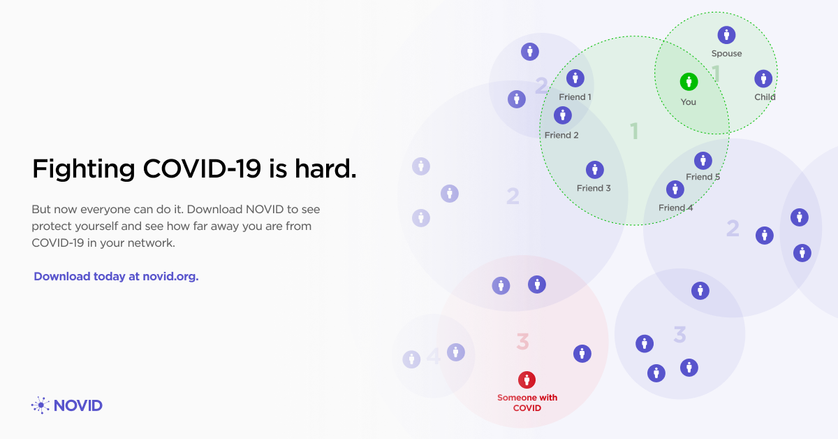
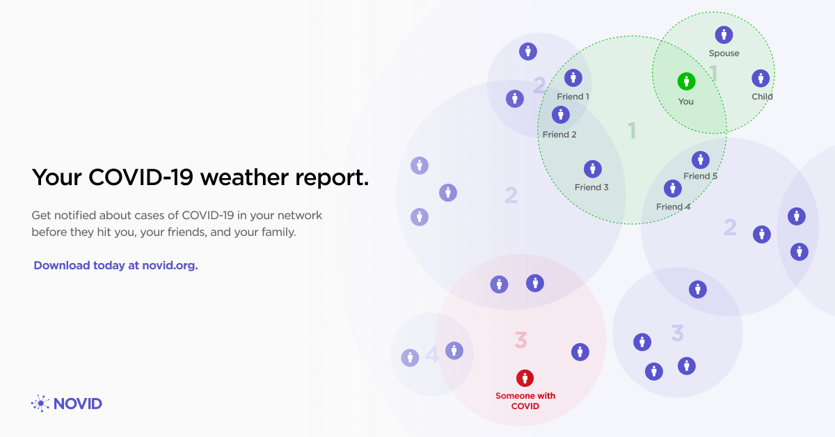
NOVID is the first pre-exposure pandemic radar to notify users of diseases in their personal networks before they get sick. It detects contacts with Bluetooth, Wi-Fi, and Ultrasound, assembling a network of anonymous connections. This approach can stop future pandemics in their tracks, with non-pharmaceutical intervention.
I lead this team of ~15 designers and engineers to design and prototype mobile and web features for the entire NOVID ecosystem. I’m responsible for planning sprints, prototyping design systems + new web and mobile features, and working with partners like Santa Fe and Carnegie Mellon to ensure smooth deployments of NOVID in their communities.
Stakeholders
Individuals
Goal: Give people the power to raise their own guard and know when diseases are in their network. Let them do all of this while preserving anonymity, and providing a simple, yet powerful UX. Give people the equivalent of a weather radar, but for disease.
Communities
Goal: Provide communities with actionable data about the health of their constituents in an anonymized dashboard. As a bonus, make it easy to create COVID-related guidance and alert community members of important updates.
Scientists
Goal: Enable access to anonymized, high quality labeled data to expedite research on COVID virality, vaccine efficacy, and symptom spread. Tap into NOVID’s world-class proximity data to learn how COVID-19 actually spreads.
For Individuals
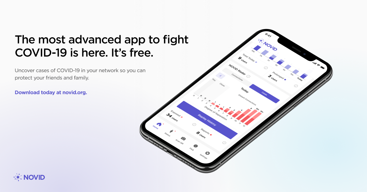
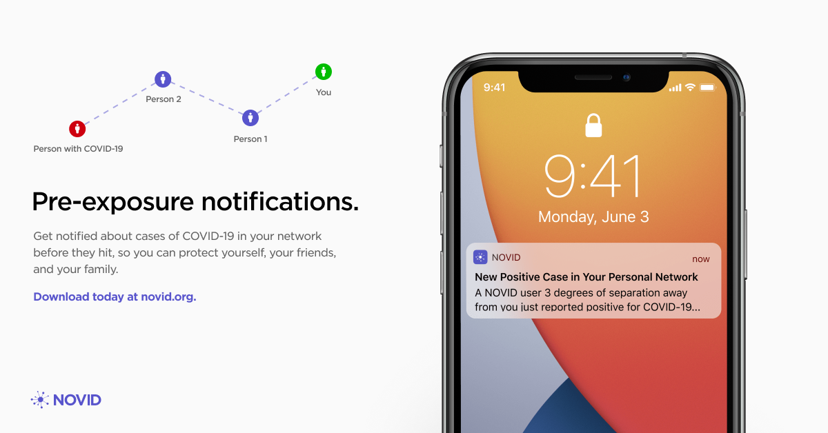
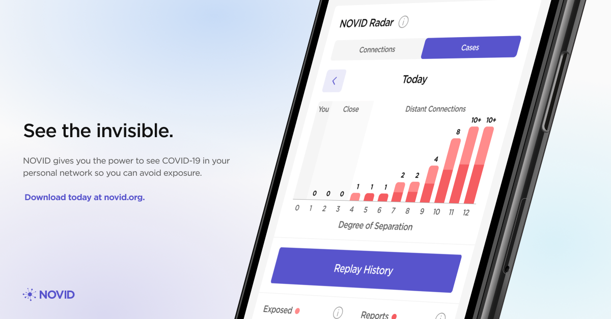
Individual users get access to a transparent and simple interface to monitor their NOVID Radar. If someone sees a positive case in their network, they receive guidance for how to take precautions.
The design of this interface went through many revisions over the last year, with an emerging trend of de-cluttering and simplifying the interface as time went on. Less is more. Prototyping this in Figma and rapidly developing it in Android/Swift proved useful in testing the feasibility of our designs. The hardest part of mobile development was implementing the Bluetooth + Ultrasound protocols, which Duncan Carroll and Po-Shen Loh architected. The bar charts and visualization were custom, and required a great deal of thought to optimize for performance. Hopefully with Jetpack Compose, we can re-do them to be more performant!
One critical decision for the mobile app was moving all of the reporting logic (reporting positive/negative/symptoms/vaccine status changes) into cleverly pre-cached web-views. I made this decision because we’d often release small changes which needed to be in-sync across both iOS and Android. With app store review times for both stores being out of sync, this made it hard for us to deliver a consistent cross-platform feature set. Moving the UI + logic into the web gave us a robust way to keep all clients up to date, while delivering a UI that’s indistinguishable from the native elements.
For Communities
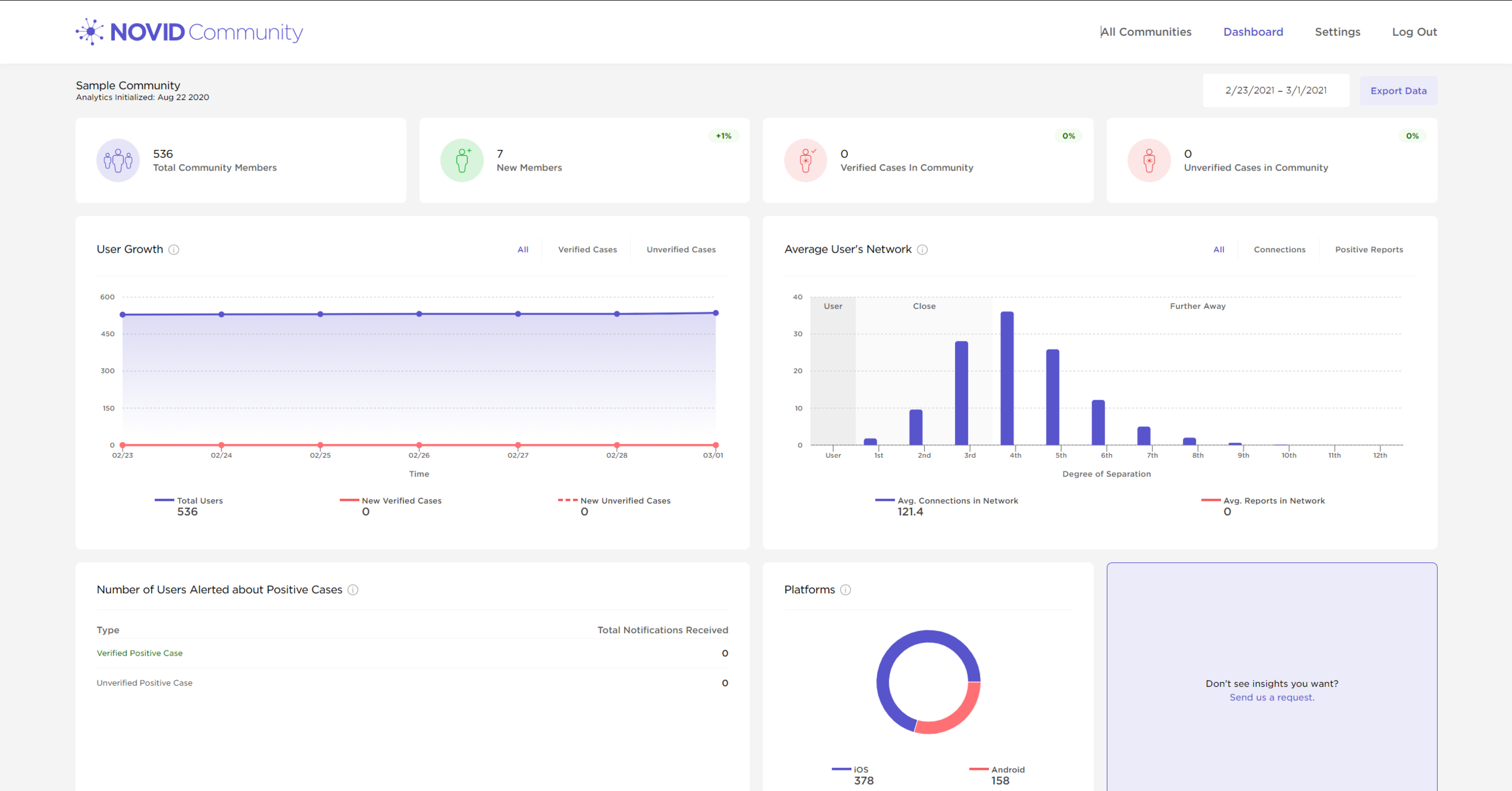
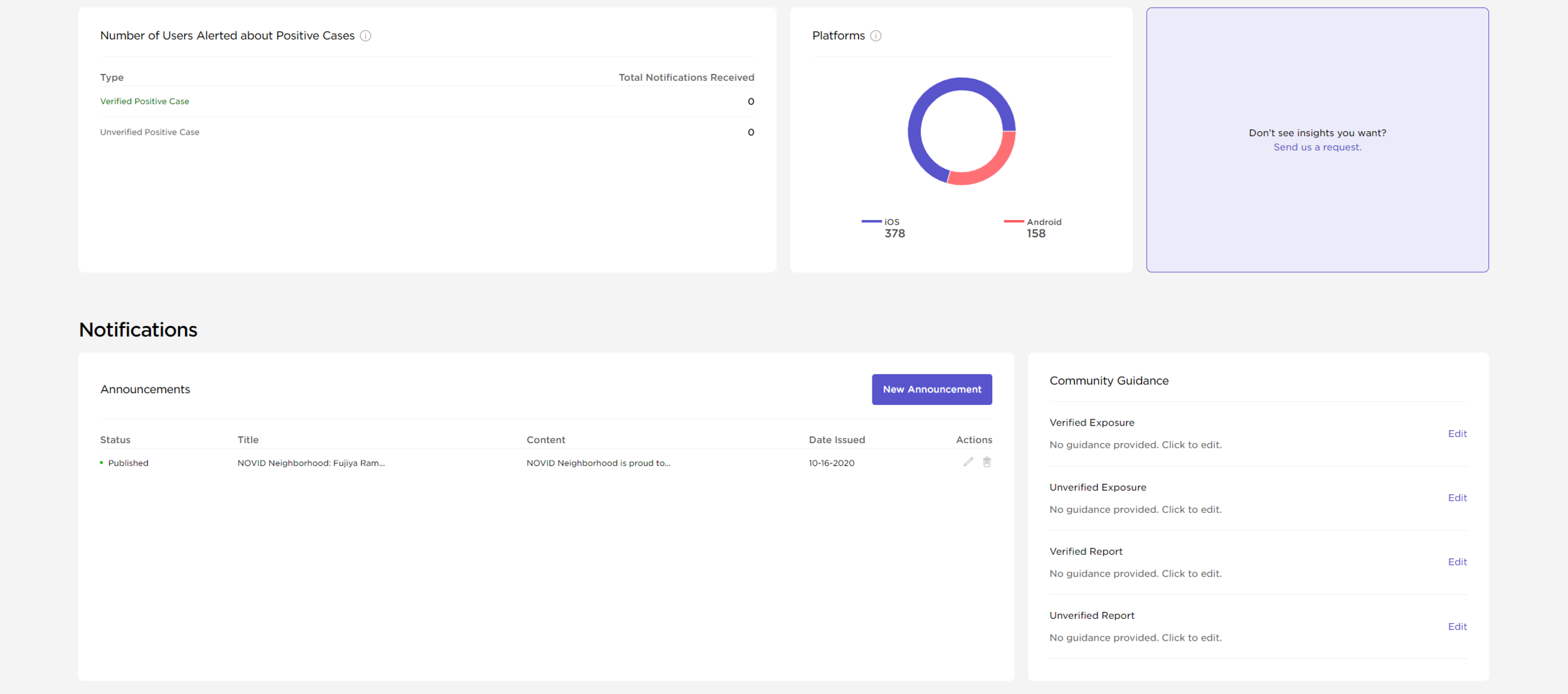
Communities get detailed, anonymized breakdowns of their members. NOVID provides a feature rich platform for data analysis, as well as COVID-19 guidance and administration with direct push notification access. This equips administrators of NOVID-powered communities with all the tools they need to monitor and adapt to their specific COVID-19 situation.
Prototyping and shipping the web application was a group effort. Kazi Jawad lead the charge on Redux implementation, while Bennett Huffman lead design system integration. My primary function was at the beginning, rapidly prototyping all of the features our partners were requesting, while also working with our Backend and Algorithms teams to standardize data models and align on spec. A lot of my job for implementing NOVID Communities was in the early set up + final QA of features, and thankfully many wonderful helping hands pushed these features out with me along the way.
For Scientists
NOVID’s latest endeavors reach far into the scientific community. Our outreach to epidemiologists and mathematicians around the world has connected us to some of the world’s best and brightest. With their help, we’ve been able to convert NOVID’s hyper-accurate contact tracing/early-warning data into one of the most useful anonymized data sets for studying COVID-19 spread and prevention. With our tools, scientists can study real data and learn how COVID-19 actually spreads.
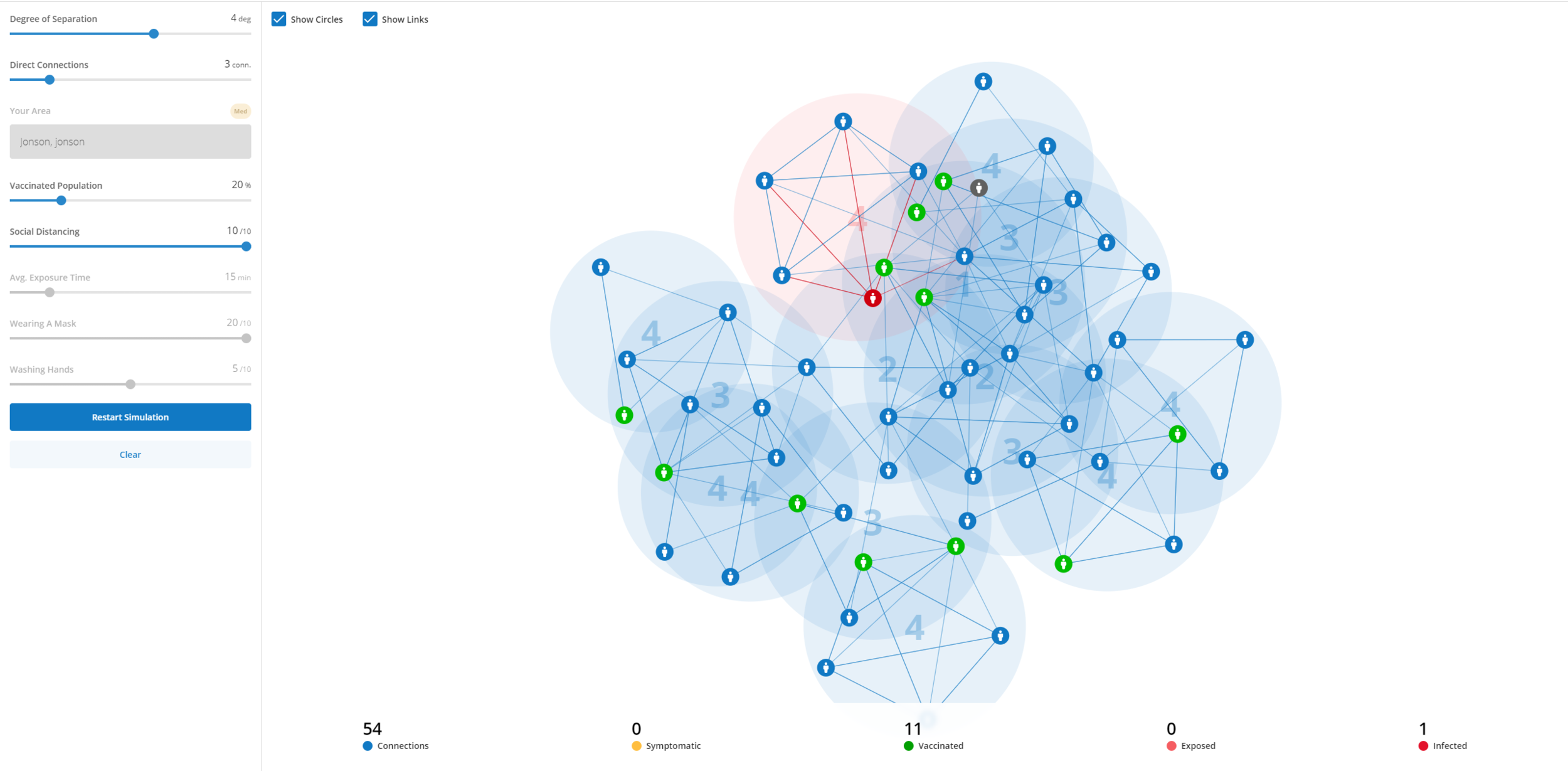
The above web application is a network-visualizer which shows anonymous Positive/Symptomatic/Exposed/Vaccinated nodes (people) in a force directed graph. Bennett Huffman lead the development of this, with assistance from our Backend and Algorithms teams to create a scalable data model for it. The tool provides a platform for temporal graph simulations as well as data upload from real NOVID Communities.
Process - Ideation

Brainstorming
In early March of 2020, Po-Shen Loh, CMU Math Professor and NOVID founder, had an idea for how to use smart phones to beat COVID. On Day 1, he brought me and another designer (Bennett Huffman) on, and Po proposed a network-based approach for solving COVID.
Diseases don’t strike randomly. They travel through networks of people to infect you. We could get ahead of diseases by doing the following: when Person A gets sick, anonymously notify Person B, and Person B’s contacts, and the entire network. This gives you the ability to spread news faster than a disease. If we could leverage Po’s network theory expertise, and roll it into a consumer-grade application, we could solve COVID-19 and future pandemics.

Mobile: Storyboard & Lo-Fi Prototypes
Bennett Huffman and I loved this network-based approach. We dove into white boarding, called our friends to pick their brains, and starting thinking about how to brand this novel approach. The key advantage we had in prototyping this was speed. We knew we only had a few months to get this right.
In NOVID’s early days, I split my time between mapping out UX in Figma, determining first principles of the “Network,” and prototyping UI in Android/iOS.

Web: Planning Information/User Hierarchy
A few months after the launch of the NOVID app, we started planning a platform to aggregate and distill the broader insights from our mobile platform into the web. We called it NOVID Community. Cities, schools, and even countries could use it to make a Community and learn about anonymized health insights from their members, and make better informed actions.
Before building it, we (acting as designers) planned the user stories, permissions, hierarchies, and common flows. We then presented our findings to the backed engineers to broker a conversation on structural complexity. AWS Amplify + Cognito Pools proved sufficient to accomplish the level of complexity we wanted, so we were able to rapidly move into prototypes once we aligned on spec.
Mobile UX/UI Evolution
NOVID has been around for a year. Take a look at its evolution below. I’ve been hands-on since Day 1, there’s too much content in our pipeline to cover in this page. If you’d like a deep-dive discussion on this, contact me!

V1: March-April 2020
Like all of my recent projects, Figma proved to be immeasurably useful in rapidly prototyping and testing. Once Bennett and I finished white boarding, we went straight to Figma. It didn’t hurt that Figma is perfectly built for remote work, and we could show all of our work in usability studies while keeping safe.
We used Expii’s brand purple, #5854CC, to dominate the color palette (although we pulled back on this in V3, V4, and beyond, more on that later). Our core UX included an Onboarding, a Dashboard to show exposures, an FAQ, and a Settings page.

V2: April-June 2020
We had a revelation. As we launched V1 of NOVID, we started seeing new apps spring up. Every other “contact tracing” app out there was a total black box, including ours. It didn’t say how many users it had connected you to, and only provided information at the moment you became exposed. We realized something big… what if we show users all the information we know about their network, even the healthy people in it?
This was pretty popular in our usability testing. People liked the idea of seeing the “Social Interactions” that NOVID had recorded. NOVID was leaving the black box world, entering a new stage of permanent transparency.

V3: June-July 2020
Now that NOVID was out in the app stores and was getting feedback from strangers all of the world, we had thousands of eyes and ears to gain insights from. We learned that our onboarding lacked specifity, and NOVID’s core value proposition (early warning) was unclear. A lot of the solutions to these problems were copy changes, but several involved simplifying and tightening up our UX to remove complexity.

V4: August-Present
A lot has happened since August 2020. I, along with Bennett Huffman and Hannah Cai, produced a brand new component library, rapidly enhancing our standardization and speed of prototyping. We stopped tracking major “versions” at this point, because our app became so agile that individual components could be rapidly updated from time to time.
When Figma Variants came out in November, our worlds changed. We could now rapidly componentize logic-tied instances of visual components, document them for engineering, and hand off specs faster and clearer. Figma yet again leveled up our game and helped our small, remote team move faster.